Baby's first
re-design.
I joined Flywheel smack in the middle of their first identity overhaul. As such, the entire UI needed to be redesigned for the new visual language and clearer brand attitude.
With "whimsy" as a core value and designers as our target, I was excited to take on the challenge.
Initial audit
I started with a big 'ol audit of the app. I was hoping to learn a few things, like —
• what are the main areas of the app?
• How many different layouts exist now?
• Could we consolidate?
This would be a massive dev project, so we'd need all the efficiencies we could find.
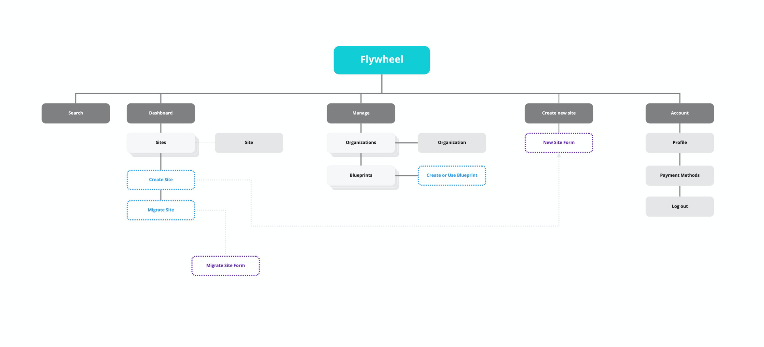
Early Flywheel IA
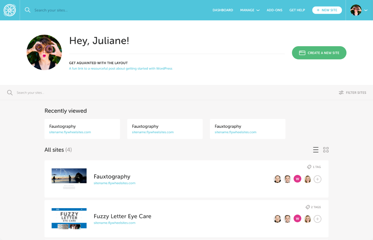
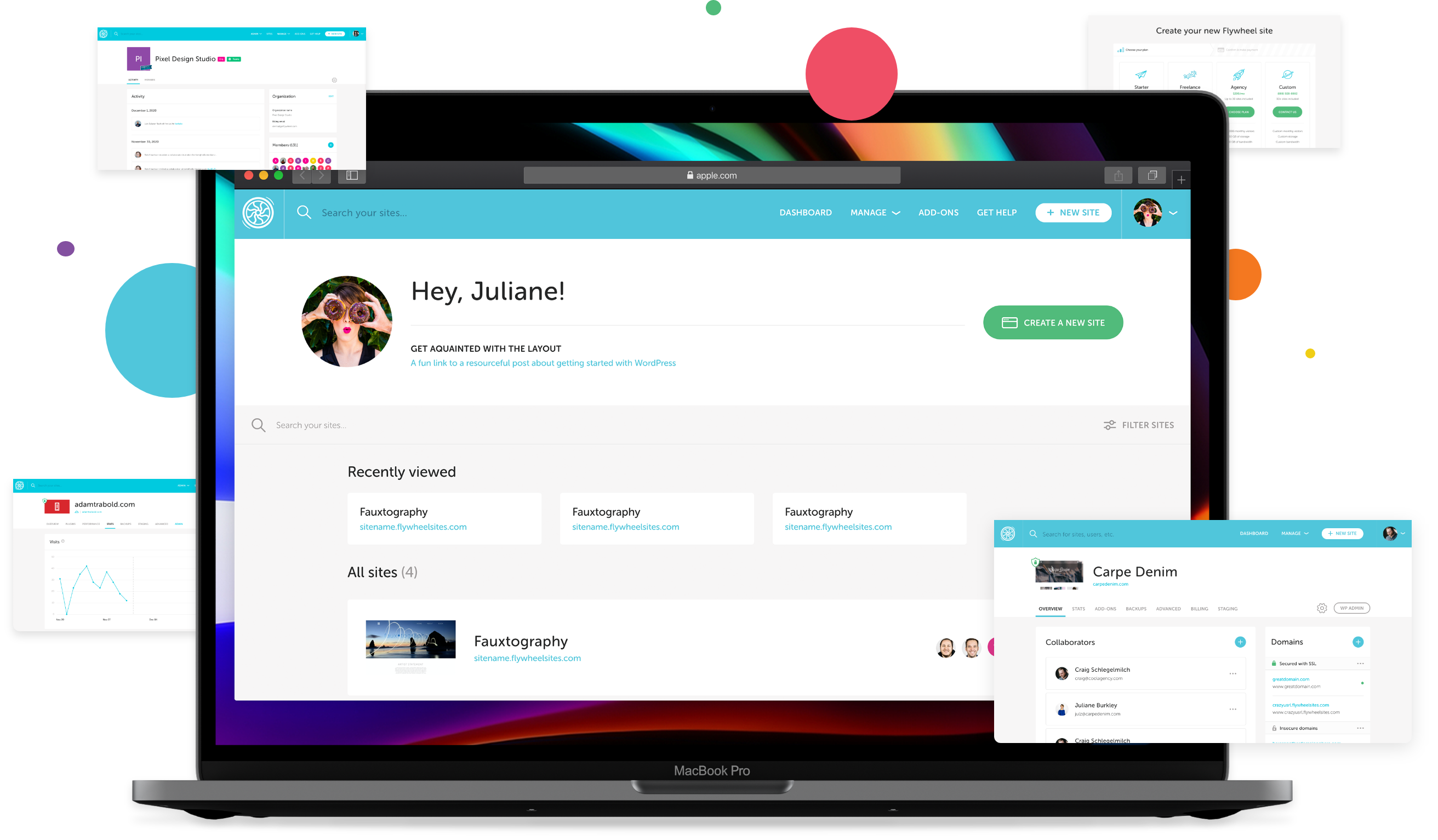
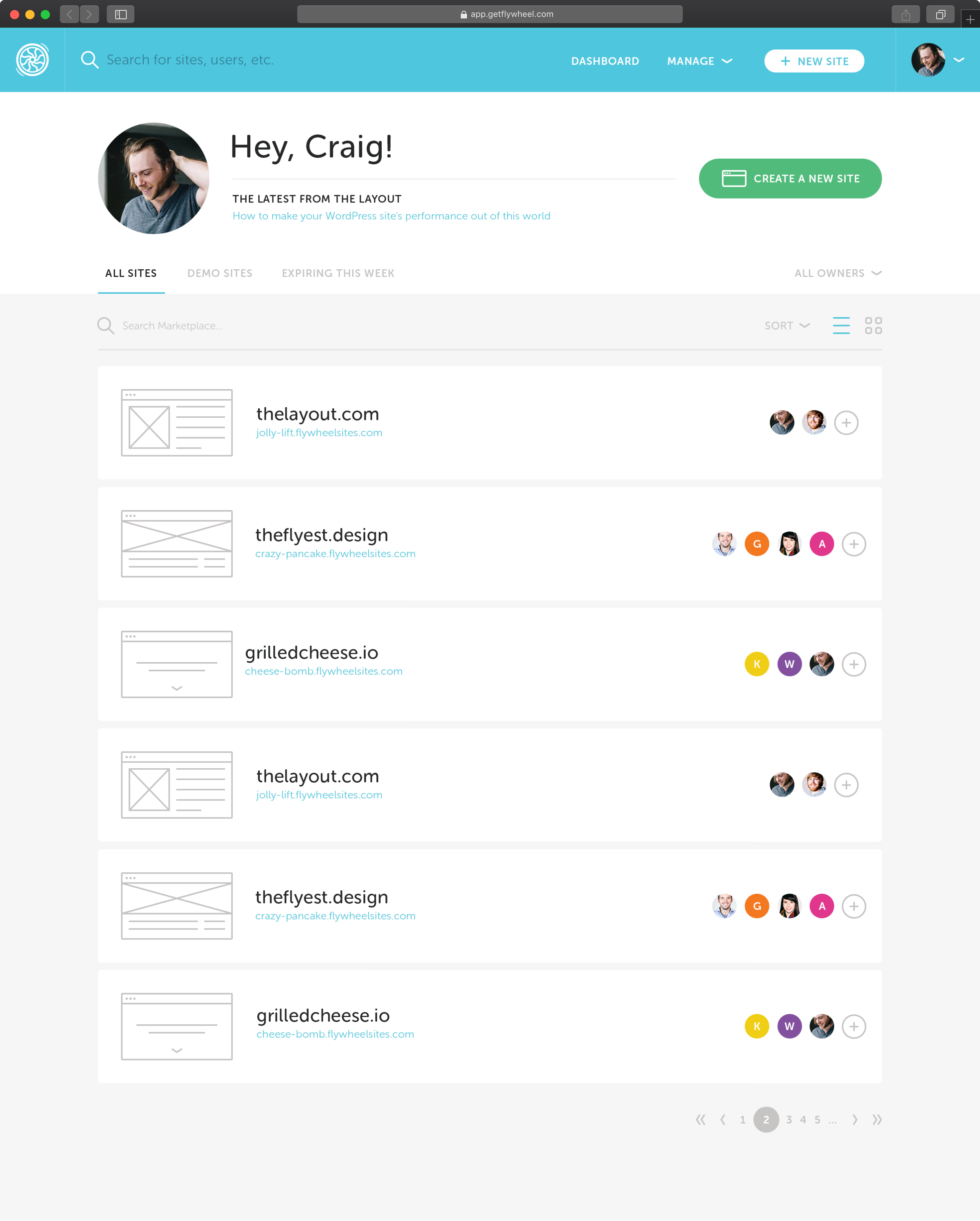
Flywheel dashboard before & after
Setting a baseline
I began working towards a strong baseline "feel" in the UI, seeking extensive feedback from the designer co-founder and our brand designer throughout.
The old UI (done by that co-founder) had a very particular sense of "underdog" I didn't want to lose just because we were growing up a bit. MailChimp, not RackSpace.
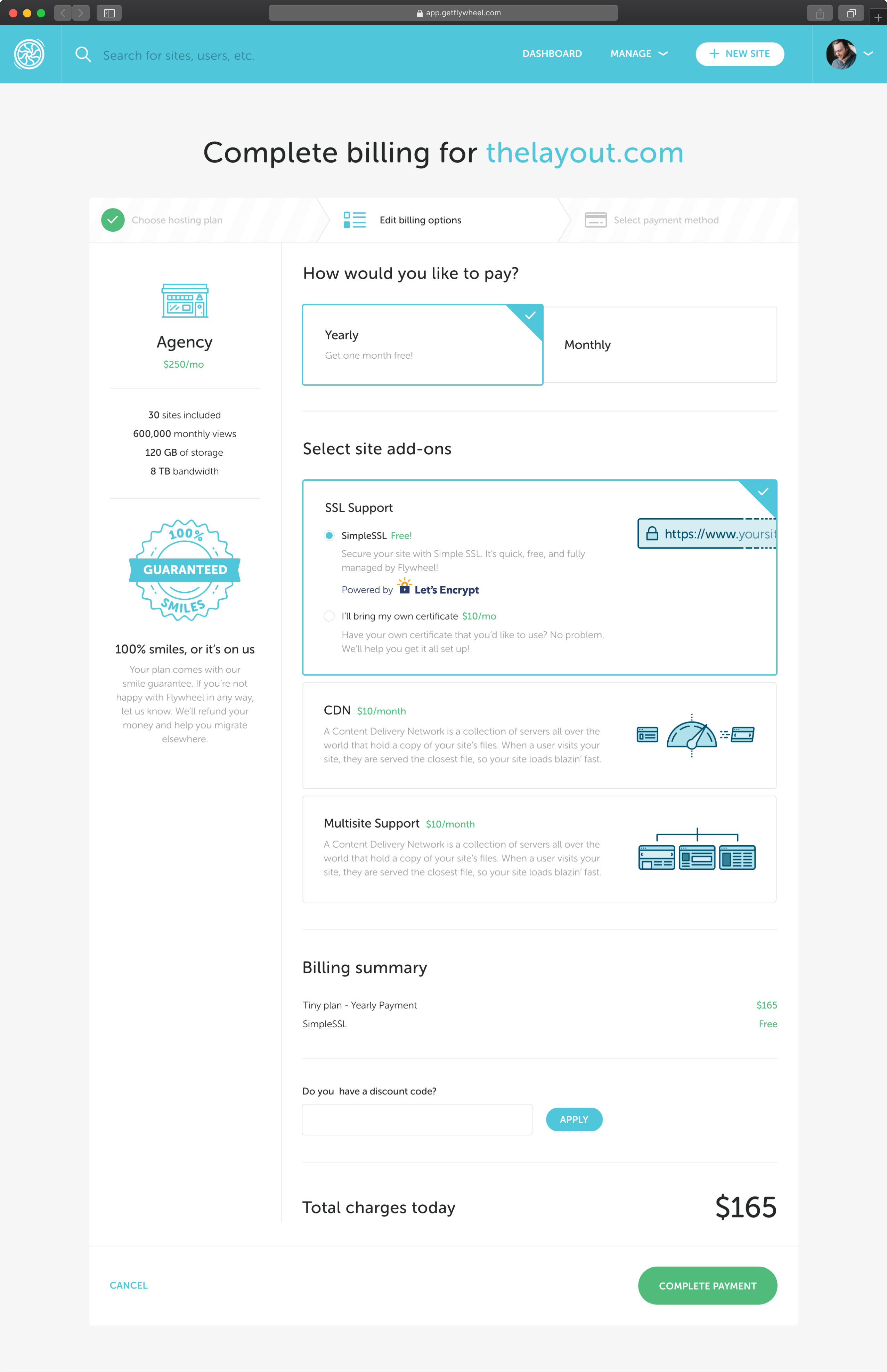
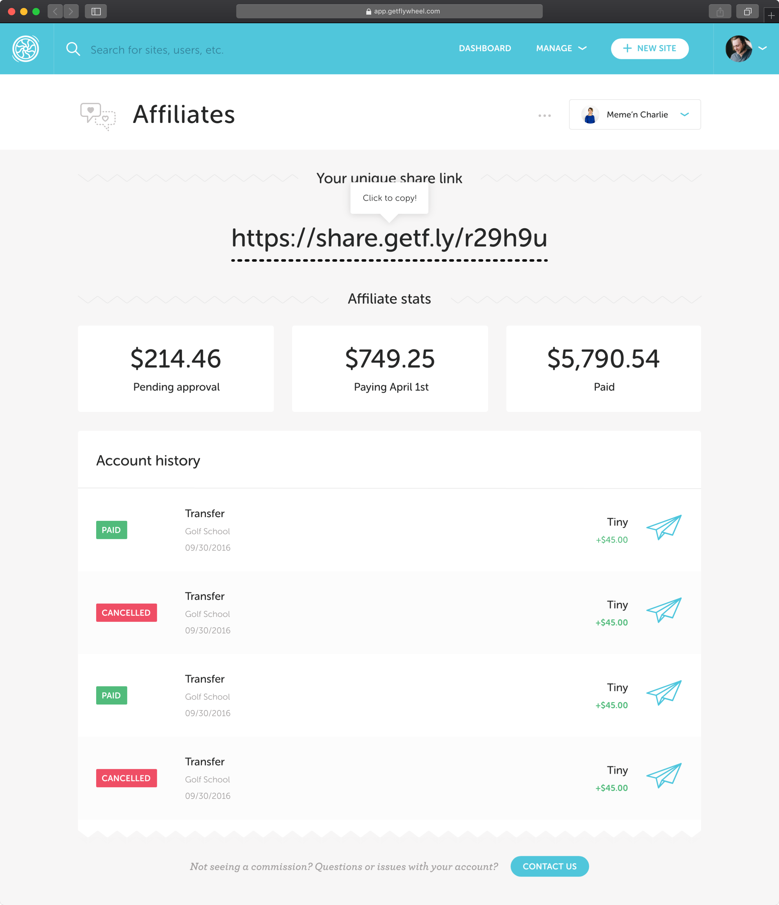
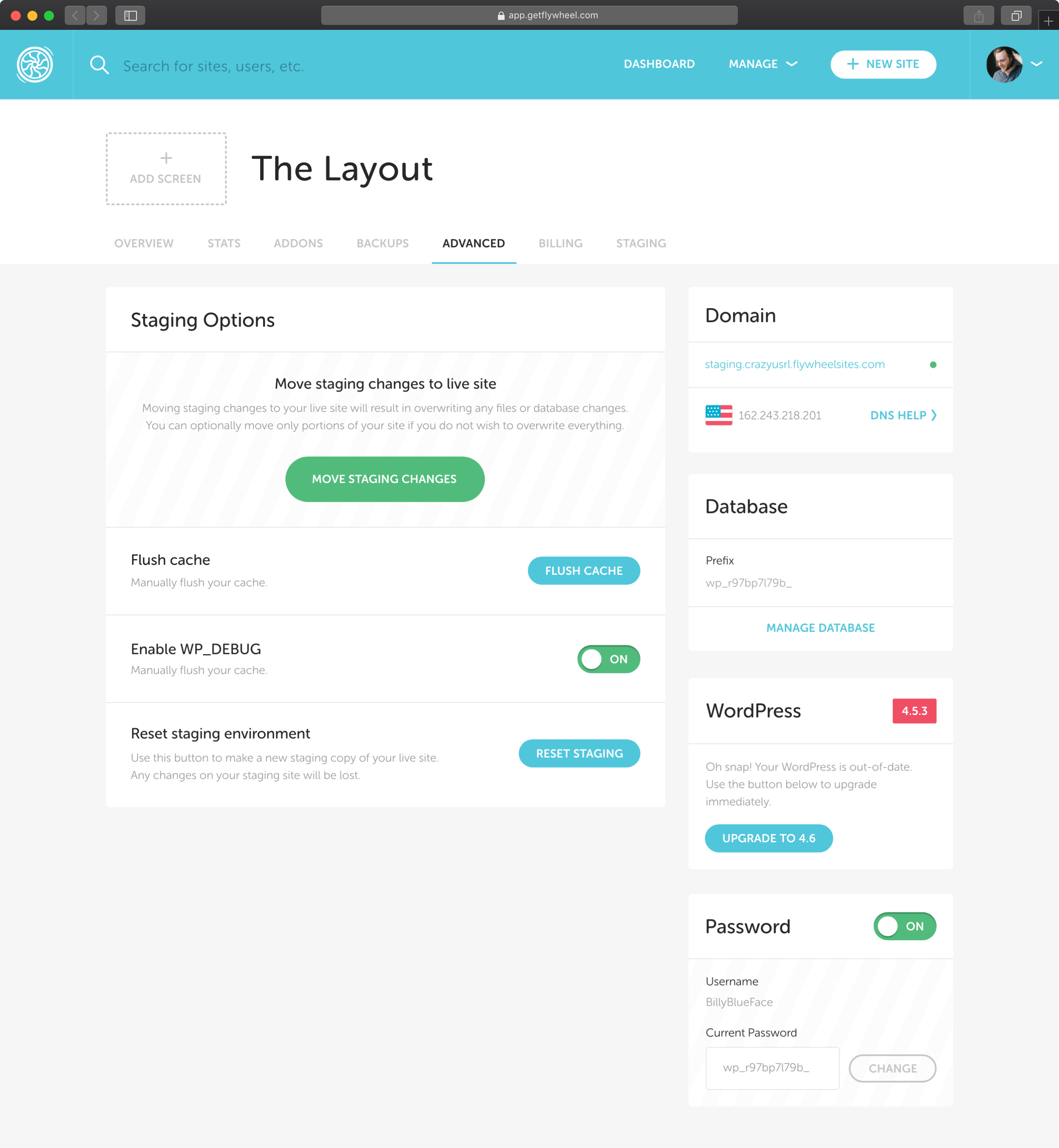
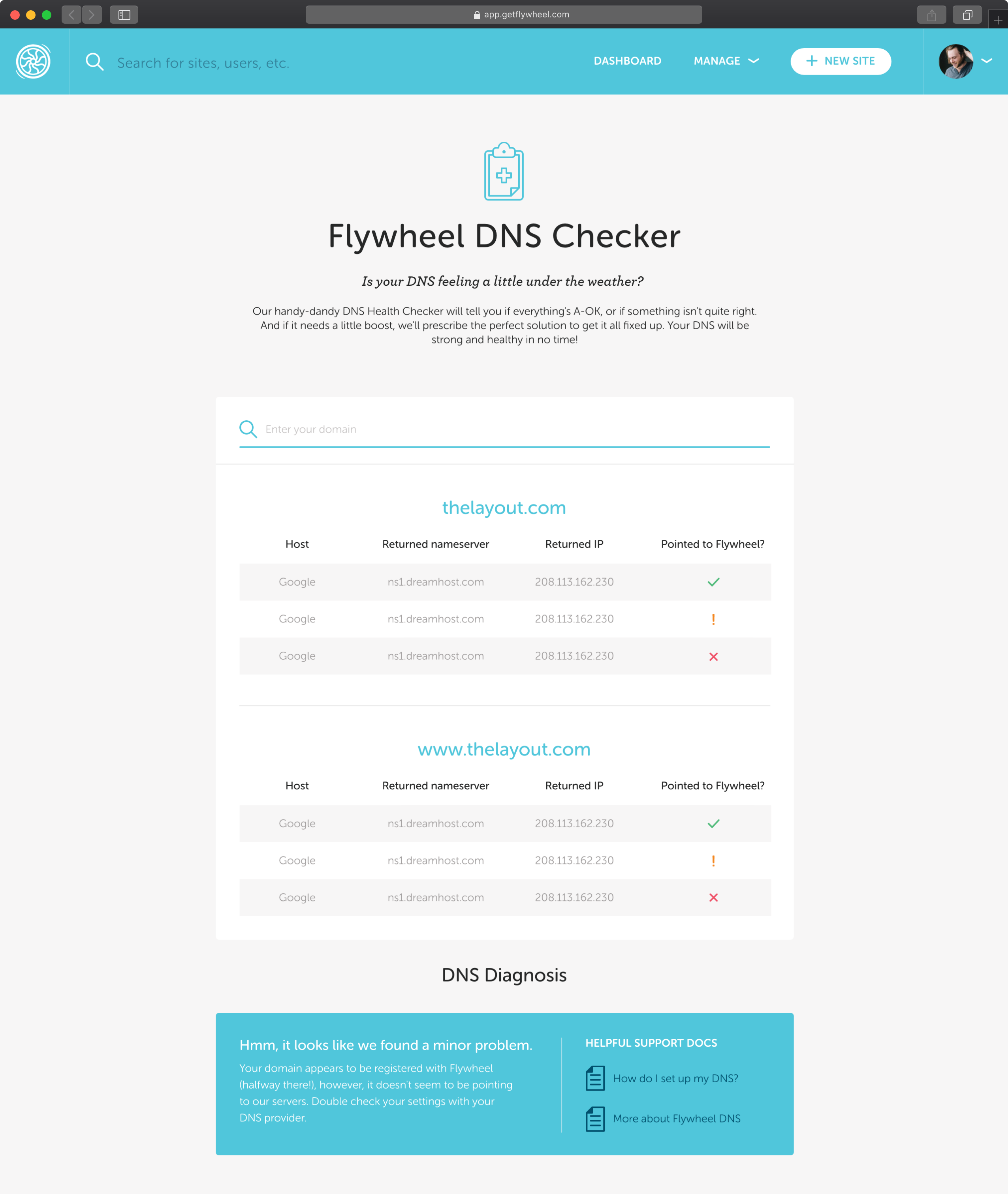
I nailed down layouts for high-value areas first, and then pulled out patterns from quick re-use in the less immediately important areas.
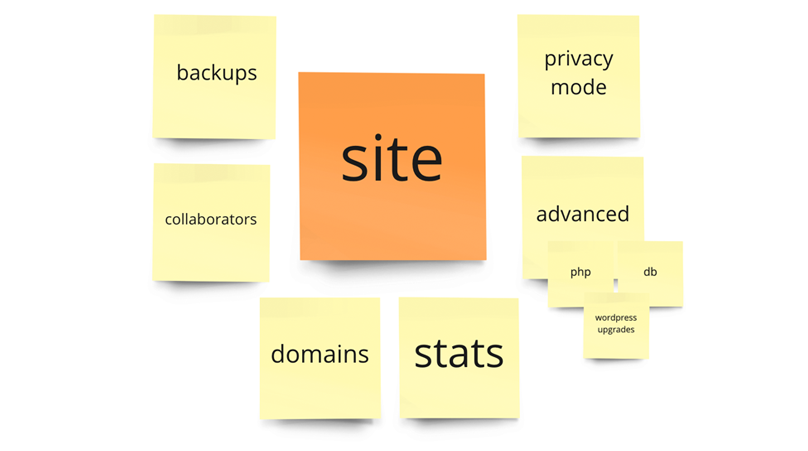
The nitty-gritty
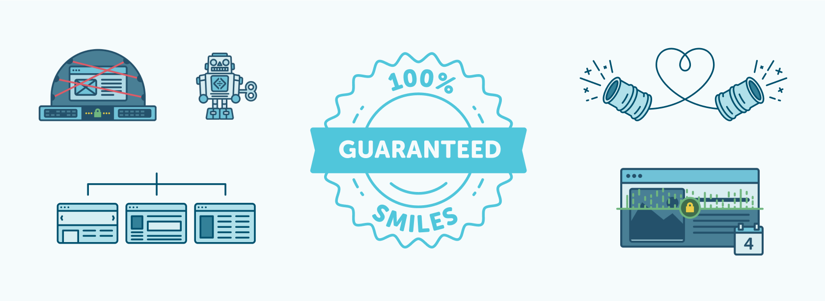
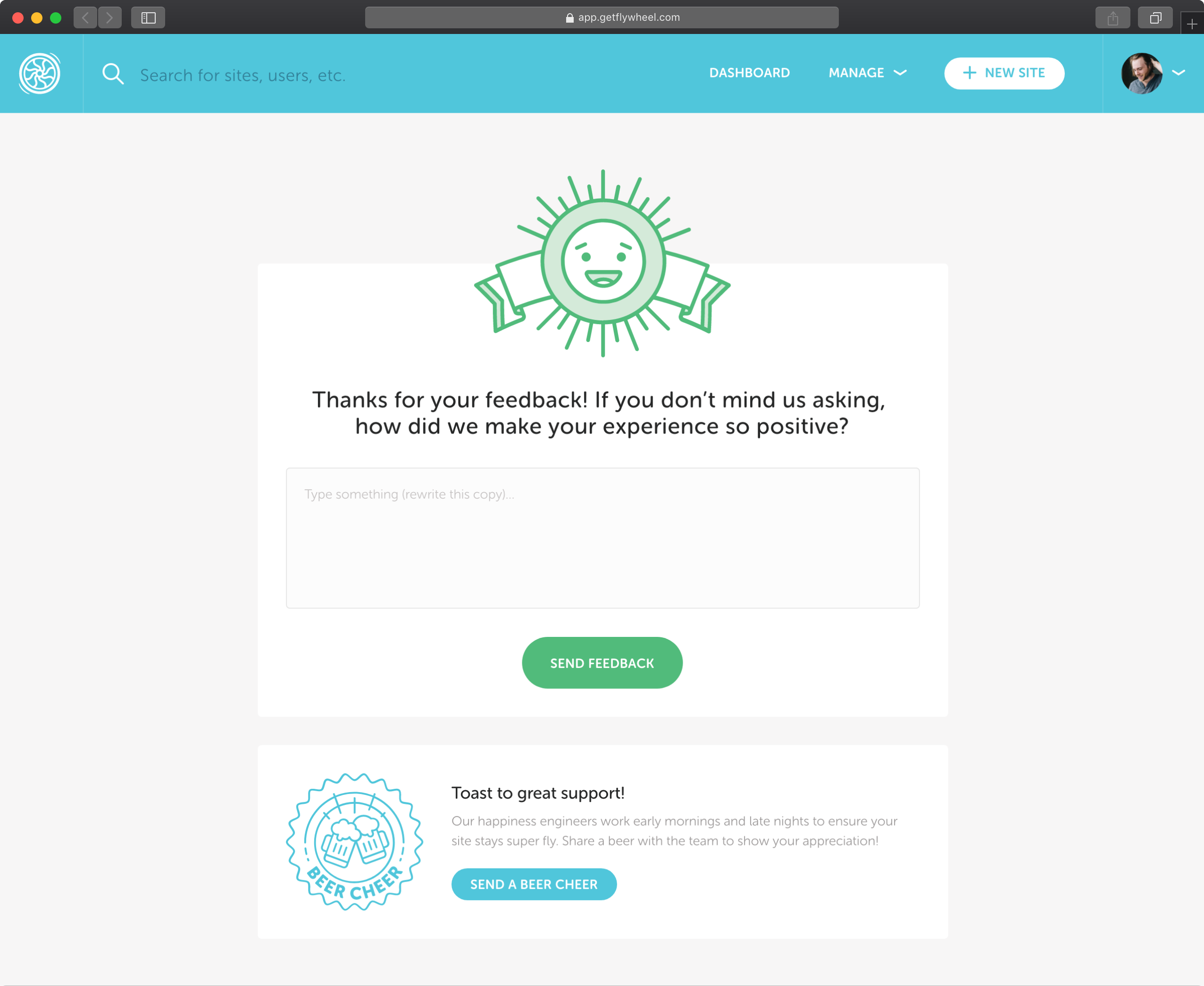
As I designed the deeper-level pages and user flows, I also needed to expand our toolset some. Taking the marketing site again as a cue, I started creating base patterns for in-app iconography and illustrations.
from style guide
to system
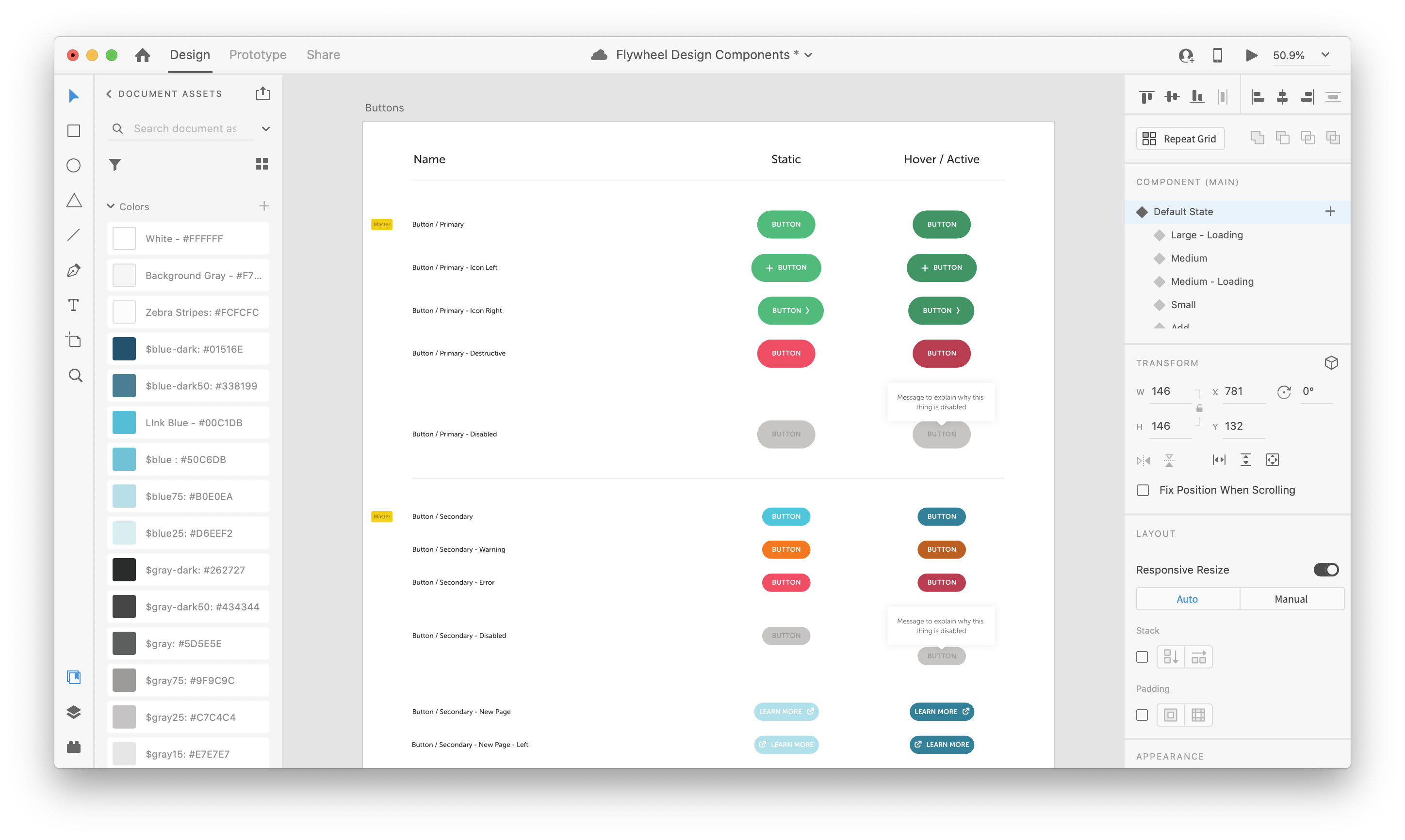
To get to MLP (minimum lovable product), I created a basic style guide with general rules on type and layout for the team to reference. Over time, we've gradually been expanding this into a full design system.
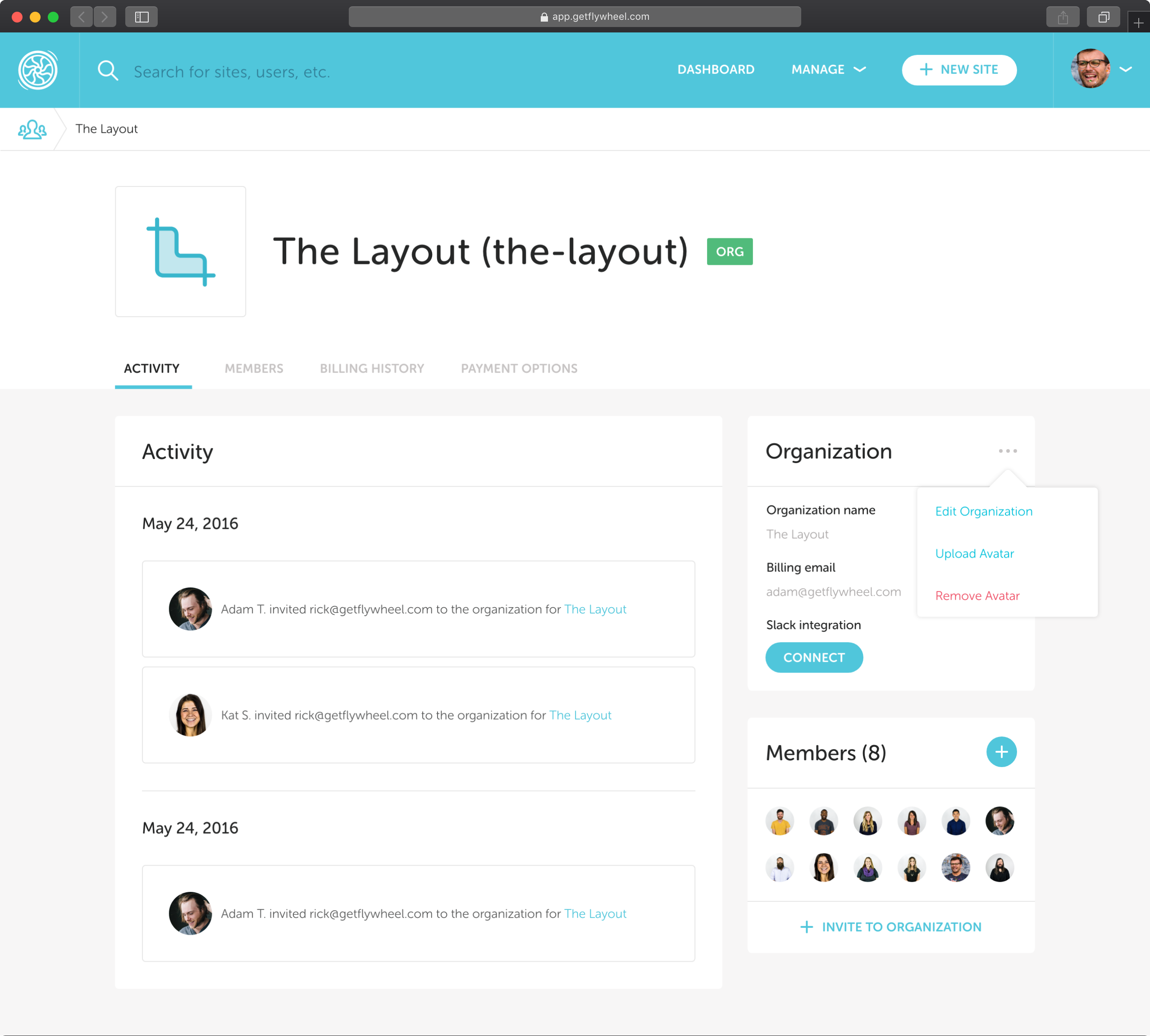
In the app, we've created an in-depth component library in the app with examples, details, and code snippets for easy re-use. On the design side, we have a great component library in XD, and are currently migrating it to Figma. Once the migration is complete, we'll get more into the education piece.
Project impact + reflection
This project ended up powerfully impacting the next phase in the product's growth. This wasn't a project full of deep UX changes, but it clarified the brand voice, created a creative environment to do what most consider technical boring work, and set us up with a framework to expand upon for years to come.
I'm still super proud of this project. Part of me can't believe we're still using the same bones I setup so long ago and that it still feels fresh. If there's one thing we know from talking to our customers, our interface's ease is a main reason they choose us over others.
We didn't know it then, but the time we spent as a team on building relationships was the smartest time we spent. This project was so complex, the whole company learned a ton about shipping product efficiently at quality. Flywheel culture was extremely engineering-led at the time, and it wasn’t natural for them to work with design for feedback or qa before launching. We stretched ourselves — breaking work down like never before, iterating on our processes, and slowly chipping away at the big rock. The working standards we created during this project set the foundation for the great team environment we have today.
let's chat!
Always open for new friends, opportunities, project partners, and mentees.